Real Time Alert Stabber
This page applies when Trisul receives alerts from an IDS such as Snort or Suricata (Trisul NSM).
The real time alert stabber is designed to be the central place for viewing IDS alerts. The idea is to explore alert activity from various angles using animation and an interactive UI.
- Alerts activity over a period of time – say the past day
- Types & Priorities of alerts
- Individual alerts as they come in with details of endpoints
- Aggregated alert activity over the period of time
- Allow pivoting of view from alert signature, end points, priority, and classification
The bubbles are interactive – you can click on any of them to access various options. In keeping with overall Trisul philosophy you can pull up flows and packets for any alert.
Accessing
👉 To access select Dashboards → Real Time Alerts
Requirements
The real time alert visualizer is a type of real time stabber. See the section of Real Time Stabbers for more. Since it requires browsers with support for WebSockets and LocalStorage, using the latest version of Google Chrome is a safe bet.
Using the Real Time Alert Stabber
Let us examine each section of the console.
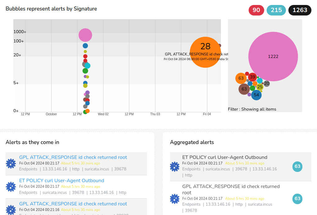
Figure: Real Time Alerts Stabber Module
Description
Consider the numbered orange circles in the screenshot above.
| Part # | Data | Description of UI module |
|---|---|---|
| 1 | Alerts by priority | Red = Priority 1, Blue = 2, Black = 3 (low). These numbers update dynamically, you can also click on them to view alerts of each category |
| 2 | Alert types bubble chart | Shows each alert type seen in the time interval as a bubble chart. This layout packs a lot of information into a small space. Hover over a bubble to access further options: highlight alerts of that type on the timeline, hide that type, or hide all bigger bubbles so you can look at the tiny ones. As alerts come in, the bubbles fill up and adjust to fit the space. |
| 3 | Timeline | Shows alert distribution over time. The Y-axis scale is multilinear, so single alerts (the quiet ones) get as much of your attention as the big ones. Within a range, the size of a circle is proportional to its occurrences. By default, the timeline shows alerts over 1 day in 1-hour intervals. Hover over an alert and click to view alerts of that type in that interval. New alerts move across the screen as they arrive. |
| 4 | Raw alerts | A dynamically updating table showing the most recent 100 alerts. The table is optimized for real-time use and shows elapsed time. Click any item to open that alert, where you have other drilldown options. |
| 5 | Aggregated alerts | Alerts by group. Most recently active groups migrate to the top of the table. Click on an alert group to view all individual alerts in that group |
| 6 | The tool bar | Controls various aspects of the visualization (see below) |
The Toolbar
The toolbar (item 6 in the screenshot above) consists of :
Pivot
Change the display by showing a different aspect of alert data as the focus (pivot). By default, the stabber shows alert signatures (alert types) as the pivot. So the bubbles represent alert signatures over time. You can modify this to Source IP, the bubbles then represent Source IP addresses over time. This way you can analyze the alert data by the following :
-
Signature (default)
-
Priority
-
Classification
-
Source IP
-
Dest IP
-
Port
Timeframe
Adjust the time window shown. The default is the past 24 hours.
Scaling
Adjust the scaling for High, Medium, and Low alert volume. This rearranges the display to help you focus on most frequently events or least frequent events. The default is medium.
Options
Clear name cache. The name cache is a browser based database used to show user friendly names, hostnames instead of IPs, etc. If you find hostnames, app names missing even after 10 minutes of running, try clearing the name cache. They are rebuilt.
Links
Some useful links