Other UI Elements
This section contains a quick overview of the user interface elements. Besides the already explained User layout and Chart UI elements, Trisul provides other essential interactive elements like Buttons, Forms, Search box, Tooltips and more. This page shows where to find these elements and how to use them.
Hide/ Show Search Form
Throughout the app, forms featuring a distinctive Hide/ Show search form button on the top blue bar providing a consistent and intuitive interface for analysis and configuration.
In the sample form below, you can notice the Hide button on the top right corner. Click on the button for hide or show search form.
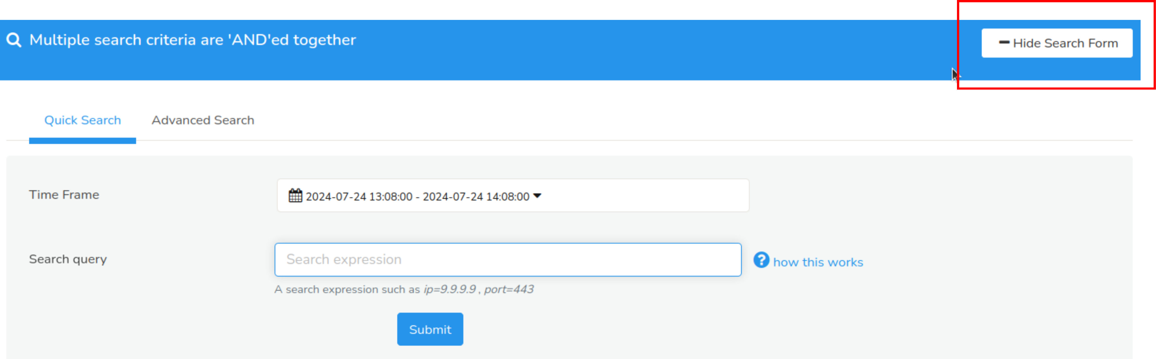
Figure: Analysis Form Showing Hide Button
- Collapse Form
Click to minimize the form, hiding its contents and allowing you to focus on analysis results. This is ideal for when you want to view more data or focus on other aspects of the app. - Expand Form
Click to restore the form to its full height, revealing its contents and enabling you to refine your analysis parameters. This is useful when you need to adjust settings or tweak your analysis.
Packets and Flows Drilldown Buttons
In the sample form below,common cues to indicate that you can view related flows or download a PCAP is mentioned.
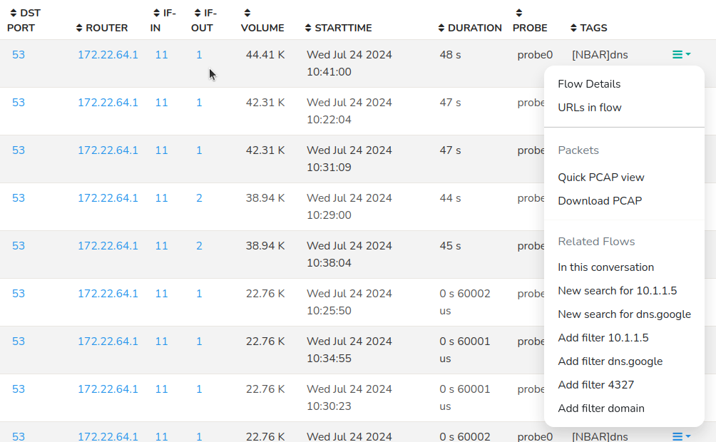
Figure: Showing Packets and Flows Drilldown Buttons
Using Search Tool
The search box is located on the right side of the Top Panel as shown here.
Enter some search text here and press Enter

Figure: Search Box
You can use the Search tool to find items of interest like:
- Search by an IP address, Port number, etc.
- Search by user labels like host names, alert signature names, etc.
- Directly type in a trisul key like p-0050
If you wish to search for resources like HTTP URLs and DNS names, you will be redirected to their search forms which are more flexible. See URL Resources and DNS Resources
Search Results
The search results page contains all items that might match your query.
- Searching for amazon.com will return x.y.amazon.com.
- Searches are case insensitive
Click on the View button to explore further
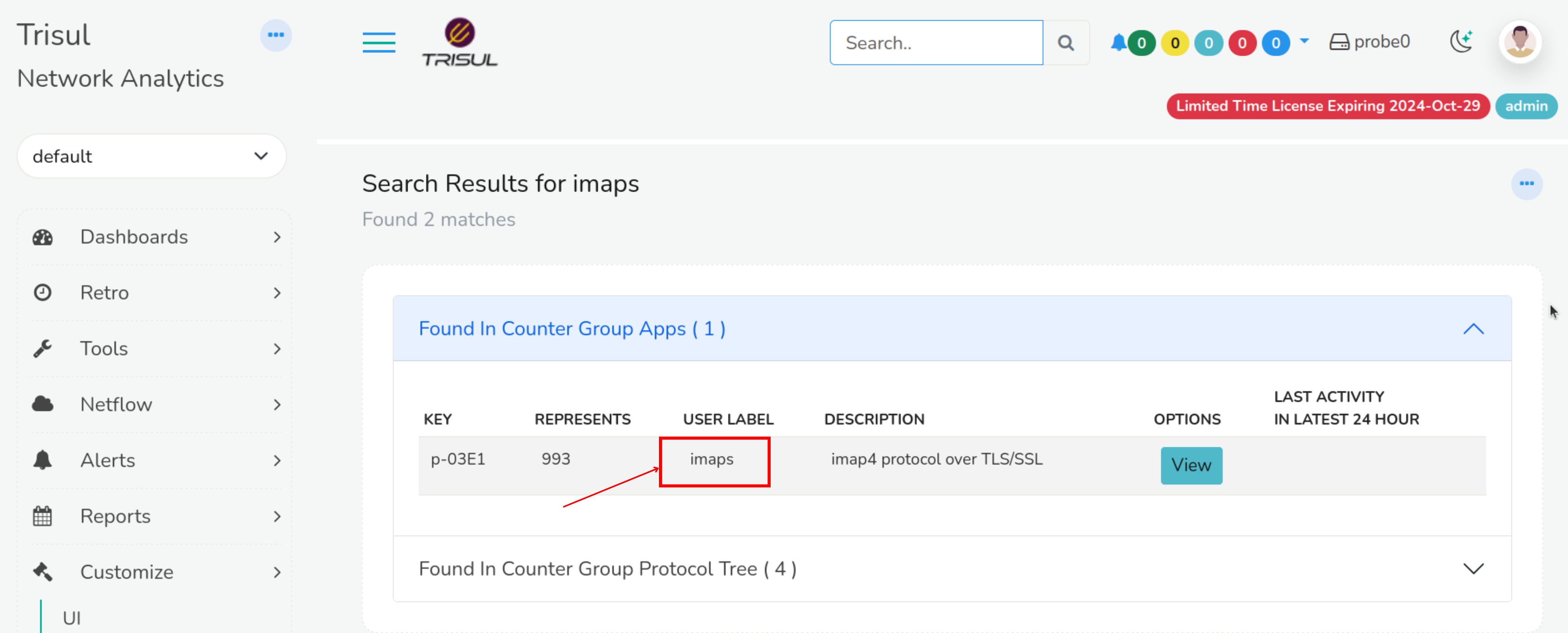
Figure: Search Result Page
AutoComplete
All relevant form fields in Trisul are autocomplete capable. This functionality is triggered when you enter three or more characters.
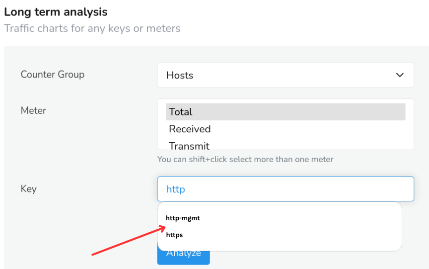
Figure: Showing AutoComplete Option of Long Term Analysis Form
Key Dashboard
You can click on any key items on the chart and it will take you to the Key dashboard of that Key.
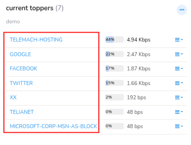
Figure: Key Dashboard
Download PCAP button
Packet capture mode onlyOn tables featuring a Download PCAP button, clicking on the button will result in Trisul computing a “Packet Scan plan” and then downloading all of the requested entities into a single merged PCAP file.
Time Selector
The Time Selector feature enables you to define a temporal scope for functionalities like report generation, query search, flow trackers, alerts etc with a default setting of the most recent 15 minutes. Once a time window is selected, it remains fixed for functioning all the features on the page and their associated drill-downs.
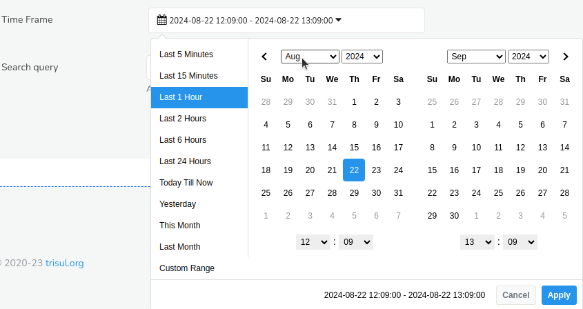
Figure: Time Selector
You can choose from a range of pre-defined time ranges, including:
-
Last 1 hour
-
Last 24 hours
-
This month
-
Last month and more.
Alternatively, you can specify a custom date range by selecting the Custom Range option, which allows for the selection of a specific period from the past.
Download Button
This is one of the most commonly found UI elements across Trisul. Clicking on the Download button enables you to download the data for sharing, backup and archive.

Figure: Download button
You can export data, reports, or analytics in various formats like,
PDF: Downloads the data in Portable Document Format (PDF), suitable for printing or sharing.
XLSX: Downloads the data in Microsoft Excel format (XLSX), suitable for editing or analysis.
CSV: Downloads the data in Comma Separated Values format (CSV), suitable for importing into other applications for analysis.
Toggle Labels
Toggle Labels button in Trisul is like a toggle switch to display the labels of keys in the search results or downloaded file.
Note that the resolved names or labels will be displayed only if the names are already assigned.

Figure: Toggle Labels
When enabled, the search result or downloaded file will include labels. When disabled, only the raw data i.e., the actual keys without labels is displayed.
Column Sorter
 Figure: Column Sorter
Column Sorter is a small up/down toggle element located typically on the column header of a table of dataset containing large volume of data. When you find the Column Sorter arrow(up/down) button on the column header of a table, it indicates each column in the table of data are sortable, that enables you to rearrange data in ascending or descending order by clicking it, for flexible data analysis and visualization.
Column Selector
The Cols dropdown menu allows users to customize the columns displayed in the resulting table.
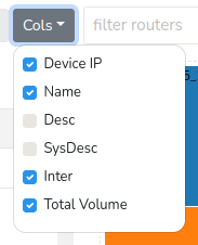
Figure: Column Options
Selecting specific columns enables users to tailor the table to display the information for those columns.