Default Dashboards
Trisul ships with a bunch of default dashboards which you will be seeing as soon as you first log in. This page describes each of them.
👉 Select Dashboards→ Show All to see all Live Dashboards
Current Hosts
A live view of current host activity. Internal hosts are shown on the left side and the external hosts on the right side. Hosts are automatically classified as internal or external based on the Home Networks. Under the screenshot you can find a description of each module.
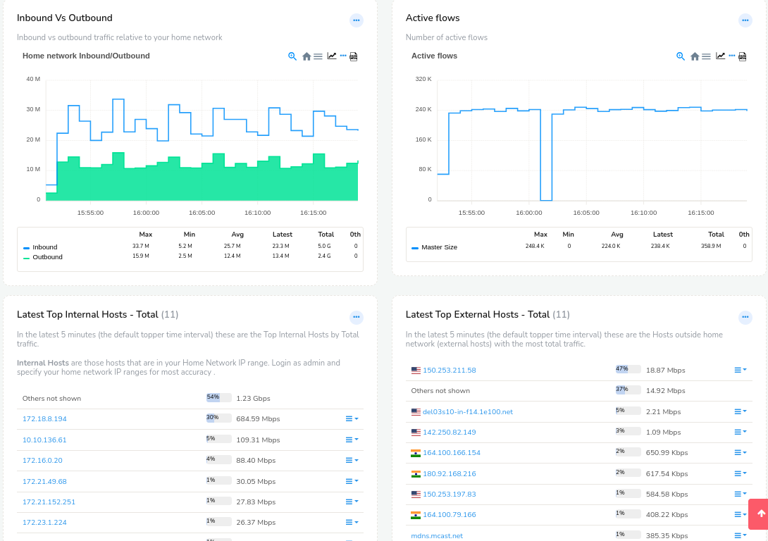
Figure: Current active internal and external hosts dashboard
The Hosts dashboard consists of the following modules
| Module Title | Description |
|---|---|
| Inbound Vs Outbound | Inbound vs outbound traffic relative to your home network |
| Active Flows | Number of concurrently active flows. See Meta Session Group counter group docs |
| Latest Top Internal Hosts - Total | The Top Internal Hosts by Total traffic bandwidth |
| Latest Top External Hosts - Total | Hosts outside home network (external hosts) by Total traffic |
| Latest Top Internal Hosts - IN | Top Internal Hosts by with most received traffic (downloaders) |
| Latest Top External Hosts - IN | Top External Hosts by with most received traffic (downloaders) |
| Latest Top Internal Hosts - OUT | Top Internal Hosts by most sent traffic (uploaders) |
| Latest Top External Hosts - OUT | Top External hosts sending most traffic to your network in the latest topper interval |
| Latest Top Internal Hosts - Connections | Connection count for internal hosts |
| Latest Top External Hosts - Connections | Connection count for external hosts |
📝 See Counter Groups reference for more details about these and other metrics
Current Apps
The Apps dashboards show a live view of the applications currently active in your network. The left column contains the current bandwidth being used by each application and the right column contains the total transferred over the past 6 hours. You can change the time interval using the time window dropwdown.
The modules in it are
| Module Title | Description |
|---|---|
| Application Trends | Top applications into and out of your network. This is a trend report that only shows the toppers traffic trends. |
| Current Top Apps - List | Bandwidth used by the Top-K applications - total traffic |
| Current Apps by conns | Top applications by concurrent connections count. These are IP connections - UDP/TCP/ICMP etc |
| Apps into network | Bandwidth used by Top-N applications downloading data into your home network |
| Apps Outof Network | Bandwidth used by Top-N application uploading data out of your home network |
| Apps by volume in past 1 Hr | Volume (GB) transferred by top-K apps |
| Apps by connections in past 1 Hr | Apps by connections over the time |
| Apps by volume incoming in past 1 Hr | Volume of data (GB) per App downloading data into your home network |
| Apps by volume outgoing in past 1 Hr | Volume of data (GB) per App uploading data out of your home network |
Drilldown Menu Options
| Option | Description |
|---|---|
| Top users of app | Displays the top hosts, users, or IP addresses generating traffic for the selected application |
| Aggregate Flows | Aggregates and summarizes flows associated with the selected application |
| Retro analyze | Opens historical traffic analysis for the selected application over previous time intervals |
| Real Time Stabber : Traffic chart | Displays real-time bandwidth and traffic activity for the selected application |
| Real Time Stab : Flow activity | Displays real-time flow creation and flow activity metrics |
| Real Time Stab : Toppers | Displays top traffic contributors and top active entities related to the selected application |
| Set/Edit Label | Allows administrators to assign or modify labels associated with the selected application or entity |
| Traffic Chart | Displays traffic trends and bandwidth usage over time |
| Long Term Traffic report | Generates long-duration historical traffic reports for the selected application |
| View Edge Graph | Displays communication relationships and traffic interactions using graphical edge visualization |
| Download PCAP | Downloads packet capture data associated with the selected application traffic |
| Query flows by tag | Searches flows associated with specific tags or classifications |
| Aggregate flows by tag | Groups and summarizes tagged flows for analysis |
| Statistics | Displays statistical information related to the selected application traffic |
Overview Dashboard
This dashboard automatically keeps updating the live overview of network summary activites.
Monitor the following live in easy charts with Click Through to more drilldown.
- Total 24-hr bandwidth with yesterdays chart for comparison
- Data Volume
- In and Out Volume
- System performance including Memory, CPU, and Packet drop percentage.
- Security alert trends and alert count
- Top hosts
- Top apps
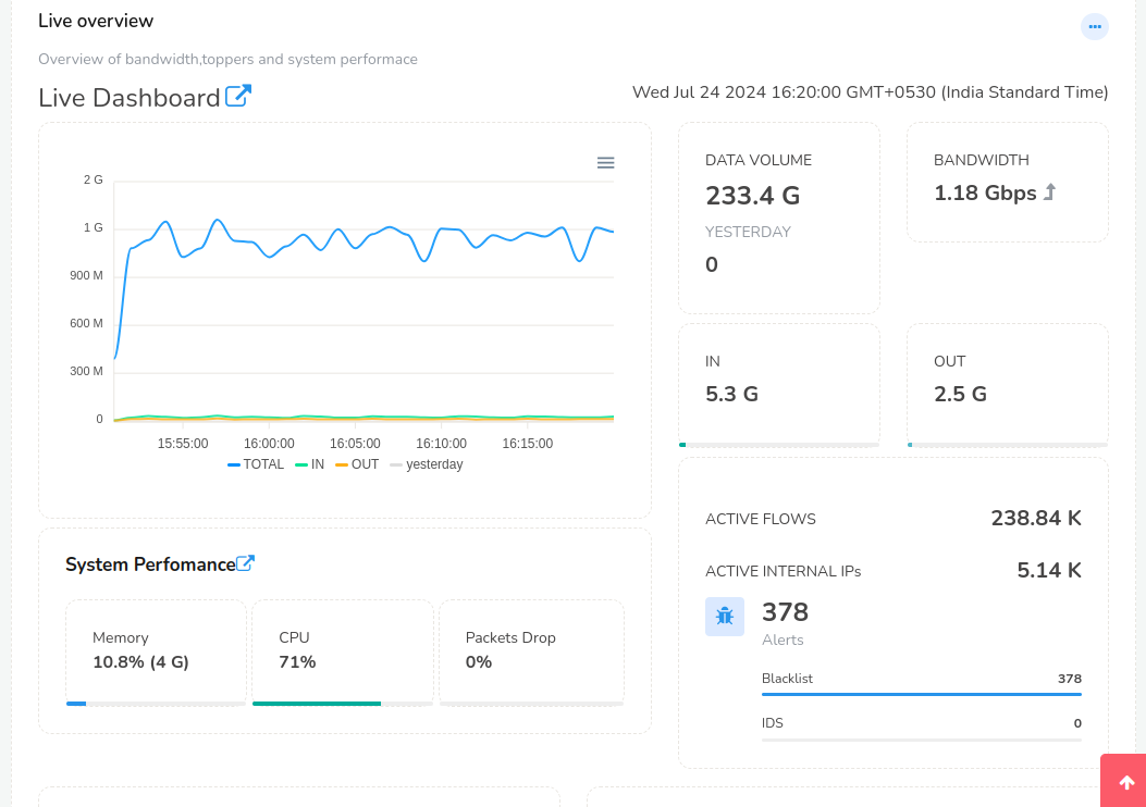
Figure: Live 1-min network traffic and security summary
Shows Top Internal Hosts, External Hosts, and Apps in 1-min real time.
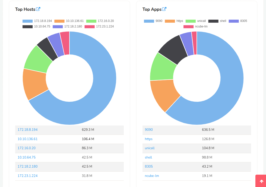
Figure: Live charts with Application usage
Modules in the Live Overview Dashboard
A top level overview of network activity.
| Module | Description |
|---|---|
| Total Bandwidth Seen | Total Bandwidth currently being used |
| Trisul Server Health | Probe database and system status |
| Current Top Host Chart | Top host by total traffic in a pie chart |
| Current Top Host-List View | Top hosts by total traffic |
| Current Top Apps Chart | Top Apps by total traffic in a pie chart |
| Current Top Apps-List View | Top Apps by total traffic |
| Data Volume | Total data volume and yesterday's data volume |
| In and Out Volume | Data In and Out Volume |
| Active Flows | Total number of active flows |
| Active Internal IPs | Total number of active internal IPs |
| Alert Trends and Alert Counts | Name of Alerts and counts |
Security
A view of network activity from a security viewpoint. This dashboard is most useful when you have connected Trisul to an IDS feed.
| Module | Description |
|---|---|
| Alert Types | A trend of recent alert types seen over a time interval |
| Alert Types and volumes | An experimental bubble visualization of alert activity |
| Total Bandwidth Seen | Total bandwidth for reference purposes |
| Alert Activity in past T hours | Alert volume (alert/min) seen |
| Intrusion Detection Alerts | Top IDS alerts as detected by Snort/Suricata |
| Aggregated Alerts in last 24 hours | Number of IDS alerts seen in the time period aggregated by alert type |
| TCP Activity | Number of TCP, SYN/SYN ACK, per minute seen over the time interval |
| ARP Flood Activity | ARP bandwidth seen over time |
| ICMP Flood Activity | ICMP activity over time. A flood can be detected as an abnormal spike |
| Recently Fired Alert Types | Alert types seen in the most recent interval |
| Recently Fired Alert Classes | Alert classes seen in the most recent interval. This maps to the alert classification as done by Snort. |
| Recent Attackers | A list of top hosts from which IDS alerts have originated as attacks. |
| Recent Victim Host | A list of hosts which IDS alerts indicate have been victims of attacks. Note that this does not mean they were breached, but only that the hosts were being attacked. |
| TCP Originators | Top TCP connections originators |
| TCP Targets | Top TCP targets |
Sessions
Shows most significant currently active IP flows. This is based on Flow Trackers a special type of streaming analytics snapshot used in Trisul. The following classes of flows are displayed.
| Module | Description |
|---|---|
| Top IP Flows in 1 hour | Top N flows transferring most number of bytes |
| Top IP Flows out of your network in the past 1 Hr | Top N flows uploading data out of your home network |
| Top Long Lived flows in past 1 Hr | Top N long duration flows. This could indicate remote desktops, SSH logins, that are not transferring much data but are nevertheless suspects for exfiltration. |
| Top flows into your network in the past 1 Hr | Downloading data into your home network |
| Top TCP Flows Uploading data based on TCP Payloads | Top TCP Flows uploading data out your home network. The difference between this and the Top UPLOAD Flows is this group measure actual Payload transferred via TCP , the first one includes all payloads+ retransmissons+TCP/IP headers. |
| Top TCP flows Downloading data based on TCP Payloads | Top TCP Flows downloading data into your home network. Payload based |
Flows tracked include TCP/UDP/GRE/IPSEC/ and all flows at IP Layer.
Real Time Alerts
A real time visualization of IDS alert activity. Note this is true realtime using WebSockets PUSH. The dashboard is described in detail in IDS Alert Stabber
Real Time Stabbers are a Trisul feature that allow the Trisul Probe network to directly push events on to the browser.
| Module | Description |
|---|---|
| Options Toolbar | Allows you to select options for Pivot (which field to pivot), Timeframe, Scaling, and Clear local name Cache |
| Bubbles representing alerts by Signature | An interactive visualization showing alert activity over time |
| Alerts as they come in | Recently pushed raw alerts |
| Aggregated alerts | Alerts types aggregated by time |
Real Time Traffic
A real time 1-second view of network traffic. This dashboard uses the underlying Real Time Stabbers framework. The stats are pushed directly to the browser from the Probe network, so the data is typically 1-2 seconds real time.
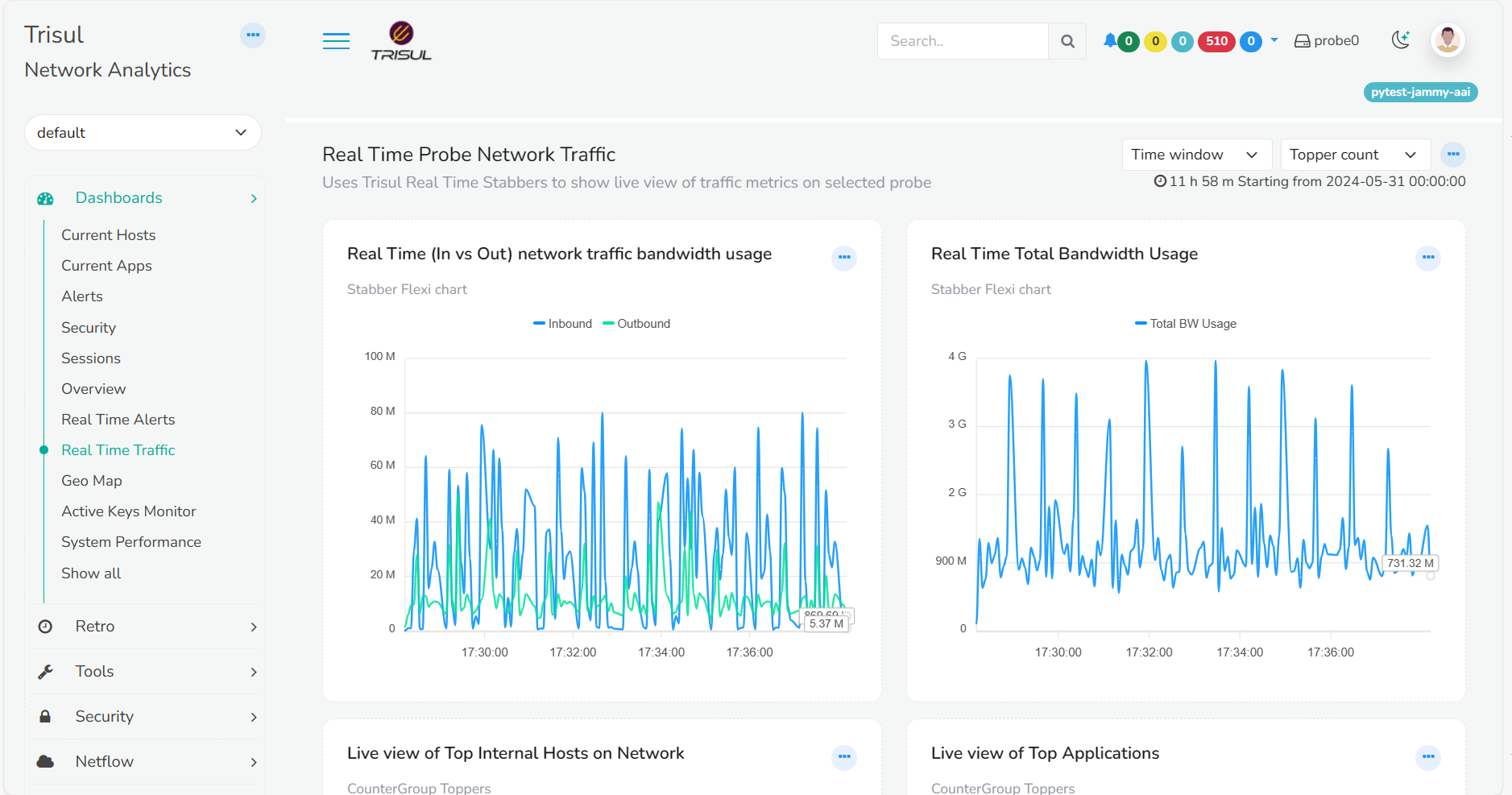
Figure: Watch a live situation of network traffic
| Module | Description |
|---|---|
| Real Time (In vs Out) network traffic bandwidth usage | Real time In vs Out network bandwidth usage. In/Out are relative to the Home Network you have configured. |
| Real Time Total Bandwidth Usage | Total bandwidth seen |
| Live view of Top Internal Hosts on Network | Currently active Internal Hosts |
| Live view of Top Applications | Currently active top applications |
Real Time Stabbers
You can watch any metric , Top-K, or Flows in real time using the Real Time Stabbers (read more)
Active Keys Monitor
A live view of the number of active keys in all counter groups. The purpose of this dashboard is to give you a one-page idea of the cardinality of your network from various different angles. For example: Do you know how many external hosts you have active over time?
For each counter group the following information is displayed
| Module | Description |
|---|---|
| Name | Counter group name. Clicking will take you to the “Long Term Charts” page showing the active keys |
| Sparkline | Number of active unique keys over the past 24 hrs . Use this to detect any abnormalities |
| Active Keys | Total number of keys currently active |
| New Keys | New Keys seen in last time interval |
| Water marks | Hi and Lo Water marks for the counter group |
System Performance
A very important dashboard to help you keep tabs of your Trisul Probe performance. The metrics shown here are not related to the network but to the Trisul Probes themselves.
| Module | Description |
|---|---|
| Trisul Global Flush Time | How much time it took for a streaming snapshot interval to finish. You may see “GlobalFlush-1” “GlobalFlush-0” etc. These represent the number of parallel streaming pipelines we have. |
| Memory Usage | Memory used by the system and the memory used by Trisul Probe instance |
| Packets Dropped | Packets dropped by each front-end parallel streaming pipeline. For example : Each AF_PACKET fanout would instantiate a separate parallel streaming engine. The total packets dropped is a sum of all the items shown |
| Packets wire | Number of packets processed by each streaming frontend pipeline |
| Packets drop percent | Represents the total dropped packets/total packets processed |
| Disk Read Write IOP | Read and Write I/O rates. When you have the Packet Ring enabled this can be useful measure disk load |
| PCAP Disk Bandwidth | A very useful statistic. Tells you at how much Mbps is the data throughput to disk. In a steady state with full packets enabled, a 100Mbps traffic monitor would also result in a 100Mbps disk bandwidth |
| Network vs PCAP Disk Bandwidth | Compare Network vs PCAP Chart is useful to test the effectiveness of your Packet Capture policy. If you have a good Pruning policy the PCAP bandwidth must be a fraction of your network bandwidth. |
More Dashboards
There are dozens of other dashboards like this and you can create your own. Clicking on the “Show All” menu item brings up a list of all dashboards. You can check them out one by one.
The intent of this page is to give you an idea of the default dashboards we have pinned to the menu out of the box.